
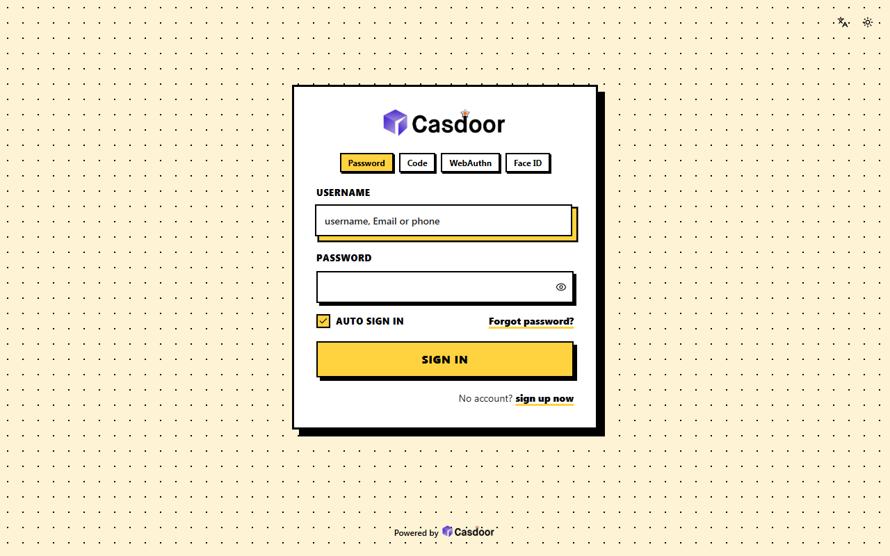
会改哪些设置
| 主题 | default |
|---|---|
| 圆角 | 0px |
| 表单位置 | 居中 |
| 表单CSS | 是 |
| 表单CSS(移动端) | 是 |
这些都在 Casdoor 应用的 界面定制 标签页里,套用主题之后还可以继续调整。
套用到应用
- 在下面填好应用,调整主题的设置,然后复制 JSON。
- 在 Casdoor 控制台打开 应用,编辑这个应用,点击顶部的 导入JSON,粘贴 JSON 后点 确定。
- 点击 保存。下次打开登录页时就会用上这个主题。
{
  "name": "<应用名称>",
  "organization": "<组织>",
  "themeData": {
    "themeType": "default",
    "colorPrimary": "#000000",
    "borderRadius": 0,
    "isCompact": false,
    "isEnabled": true
  },
  "formOffset": 2,
  "formCss": "<style>\n.login-background {\n  color-scheme: light;\n  --background: 45 100% 96%;\n  --foreground: 0 0% 0%;\n  --card: 0 0% 100%;\n  --card-foreground: 0 0% 0%;\n  --popover: 0 0% 100%;\n  --popover-foreground: 0 0% 0%;\n  --muted: 45 60% 92%;\n  --muted-foreground: 0 0% 15%;\n  --accent: 45 60% 92%;\n  --accent-foreground: 0 0% 0%;\n  --border: 0 0% 0%;\n  --input: 0 0% 0%;\n  --ring: 0 0% 0%;\n  font-family: 'Space Grotesk', 'Archivo', ui-sans-serif, system-ui, -apple-system, 'Segoe UI', sans-serif;\n  background-color: #fff3d6;\n  background-image: radial-gradient(#000000 1.2px, transparent 1.3px);\n  background-size: 22px 22px;\n}\n.login-content > div {\n  max-width: 440px;\n}\n.login-panel {\n  border: 3px solid #000000;\n  border-radius: 0;\n  background: #ffffff;\n  box-shadow: 10px 10px 0 #000000;\n}\n.login-background > div:first-of-type button {\n  color: #000000;\n}\n.signin-methods > div {\n  height: auto;\n  padding: 0;\n  border: none;\n  background: transparent;\n  overflow: visible;\n}\n.signin-methods [role='tablist'] {\n  gap: 8px;\n  overflow: visible;\n}\n.signin-methods [role='tab'] {\n  flex: none !important;\n  padding: 4px 10px;\n  border: 2px solid #000000;\n  border-radius: 0;\n  background: #ffffff !important;\n  color: #000000;\n  font-weight: 700;\n  box-shadow: 2px 2px 0 #000000 !important;\n}\n.signin-methods [role='tab'][data-state='active'] {\n  background: #ffd23f !important;\n}\n.login-form label {\n  color: #000000;\n  font-size: 13px;\n  font-weight: 800;\n  letter-spacing: 0.04em;\n  text-transform: uppercase;\n}\n.login-form input:not([type='checkbox']):not([type='radio']) {\n  height: 46px;\n  border: 2.5px solid #000000;\n  border-radius: 0;\n  background: #ffffff;\n  color: #000000;\n  font-weight: 600;\n  box-shadow: 4px 4px 0 #000000;\n  transition: transform 0.08s, box-shadow 0.08s;\n}\n.login-form input:not([type='checkbox']):not([type='radio']):focus {\n  outline: none;\n  background: #ffffff;\n  box-shadow: 6px 6px 0 #ffd23f, 6px 6px 0 2.5px #000000;\n  transform: translate(-2px, -2px);\n}\n.login-form [role='checkbox'] {\n  width: 20px;\n  height: 20px;\n  border: 2.5px solid #000000;\n  border-radius: 0;\n  background: #ffffff;\n}\n.login-form [role='checkbox'][data-state='checked'] {\n  background: #ffd23f;\n  color: #000000;\n}\n.login-form a {\n  color: #000000;\n  font-weight: 800;\n  text-decoration: underline;\n  text-decoration-thickness: 3px;\n  text-decoration-color: #ffd23f;\n  text-underline-offset: 3px;\n}\n.login-form .login-button {\n  height: 52px;\n  border: 2.5px solid #000000;\n  border-radius: 0;\n  background: #ffd23f;\n  color: #000000;\n  font-size: 16px;\n  font-weight: 800;\n  letter-spacing: 0.04em;\n  text-transform: uppercase;\n  box-shadow: 5px 5px 0 #000000;\n  transition: transform 0.08s, box-shadow 0.08s;\n}\n.login-form .login-button:hover {\n  background: #ffd23f;\n  box-shadow: 2px 2px 0 #000000;\n  transform: translate(3px, 3px);\n}\n#footer {\n  color: #000000;\n  font-weight: 600;\n}\n.login-form .login-forget-password {\n  width: 100%;\n}\n</style>",
  "formCssMobile": "<style>\n.login-background {\n  color-scheme: light;\n  --background: 45 100% 96%;\n  --foreground: 0 0% 0%;\n  --card: 0 0% 100%;\n  --card-foreground: 0 0% 0%;\n  --popover: 0 0% 100%;\n  --popover-foreground: 0 0% 0%;\n  --muted: 45 60% 92%;\n  --muted-foreground: 0 0% 15%;\n  --accent: 45 60% 92%;\n  --accent-foreground: 0 0% 0%;\n  --border: 0 0% 0%;\n  --input: 0 0% 0%;\n  --ring: 0 0% 0%;\n  font-family: 'Space Grotesk', 'Archivo', ui-sans-serif, system-ui, -apple-system, 'Segoe UI', sans-serif;\n  background-color: #fff3d6;\n  background-image: radial-gradient(#000000 1.2px, transparent 1.3px);\n  background-size: 22px 22px;\n}\n.login-content {\n  padding-left: 14px;\n  padding-right: 22px;\n}\n.login-background .login-content .login-panel.login-panel-bleed,\n.login-panel {\n  padding-top: 24px;\n  padding-bottom: 4px;\n  border: 3px solid #000000;\n  border-radius: 0;\n  background: #ffffff;\n  box-shadow: 7px 7px 0 #000000;\n}\n.login-background > div:first-of-type button {\n  color: #000000;\n}\n.signin-methods > div {\n  height: auto;\n  padding: 0;\n  border: none;\n  background: transparent;\n  overflow: visible;\n}\n.signin-methods [role='tablist'] {\n  gap: 8px;\n  overflow: visible;\n}\n.signin-methods [role='tab'] {\n  flex: none !important;\n  padding: 4px 10px;\n  border: 2px solid #000000;\n  border-radius: 0;\n  background: #ffffff !important;\n  color: #000000;\n  font-weight: 700;\n  box-shadow: 2px 2px 0 #000000 !important;\n}\n.signin-methods [role='tab'][data-state='active'] {\n  background: #ffd23f !important;\n}\n.login-form label {\n  color: #000000;\n  font-size: 13px;\n  font-weight: 800;\n  letter-spacing: 0.04em;\n  text-transform: uppercase;\n}\n.login-form input:not([type='checkbox']):not([type='radio']) {\n  height: 46px;\n  border: 2.5px solid #000000;\n  border-radius: 0;\n  background: #ffffff;\n  color: #000000;\n  font-weight: 600;\n  box-shadow: 4px 4px 0 #000000;\n  transition: transform 0.08s, box-shadow 0.08s;\n}\n.login-form input:not([type='checkbox']):not([type='radio']):focus {\n  outline: none;\n  background: #ffffff;\n  box-shadow: 6px 6px 0 #ffd23f, 6px 6px 0 2.5px #000000;\n  transform: translate(-2px, -2px);\n}\n.login-form [role='checkbox'] {\n  width: 20px;\n  height: 20px;\n  border: 2.5px solid #000000;\n  border-radius: 0;\n  background: #ffffff;\n}\n.login-form [role='checkbox'][data-state='checked'] {\n  background: #ffd23f;\n  color: #000000;\n}\n.login-form a {\n  color: #000000;\n  font-weight: 800;\n  text-decoration: underline;\n  text-decoration-thickness: 3px;\n  text-decoration-color: #ffd23f;\n  text-underline-offset: 3px;\n}\n.login-form .login-button {\n  height: 52px;\n  border: 2.5px solid #000000;\n  border-radius: 0;\n  background: #ffd23f;\n  color: #000000;\n  font-size: 16px;\n  font-weight: 800;\n  letter-spacing: 0.04em;\n  text-transform: uppercase;\n  box-shadow: 5px 5px 0 #000000;\n  transition: transform 0.08s, box-shadow 0.08s;\n}\n.login-form .login-button:hover {\n  background: #ffd23f;\n  box-shadow: 2px 2px 0 #000000;\n  transform: translate(3px, 3px);\n}\n#footer {\n  color: #000000;\n  font-weight: 600;\n}\n.login-form .login-forget-password {\n  width: 100%;\n}\n</style>"
}更多登录主题
查看全部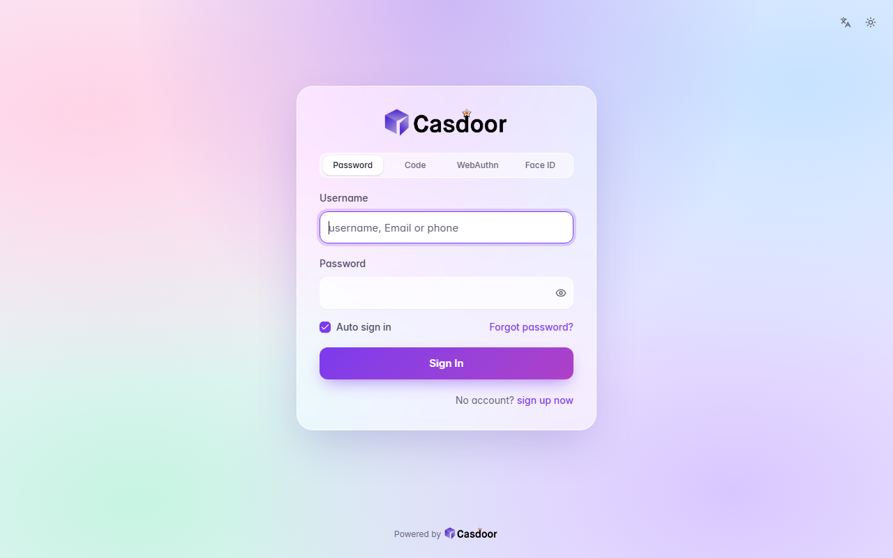
Aurora
登录主题A pastel mesh of color tinted by your accent behind a frosted glass card, with soft rounded fields and a gradient button. CSS only, so organization admins can install it.
浅色毛玻璃渐变
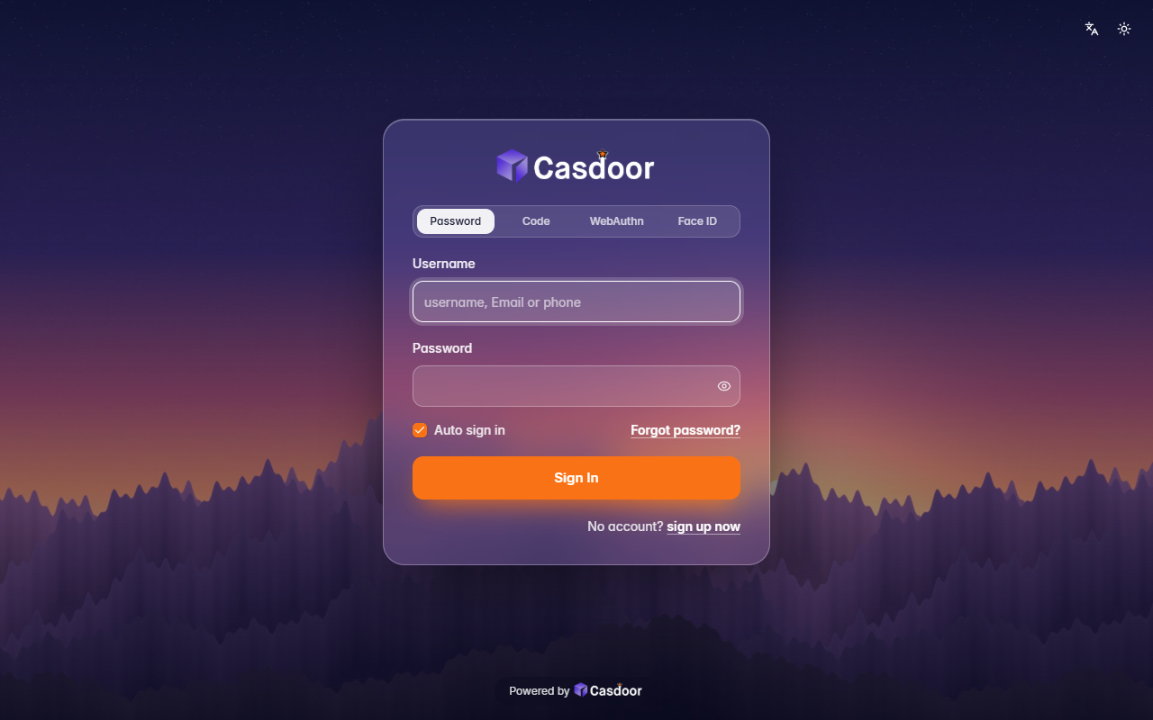
Backdrop
登录主题Your own picture behind the whole page, dimmed a little, with a frosted glass card on top. It comes with a dusk mountain scene; give it any image address to use yours. Organization admins can install it.
深色背景图毛玻璃
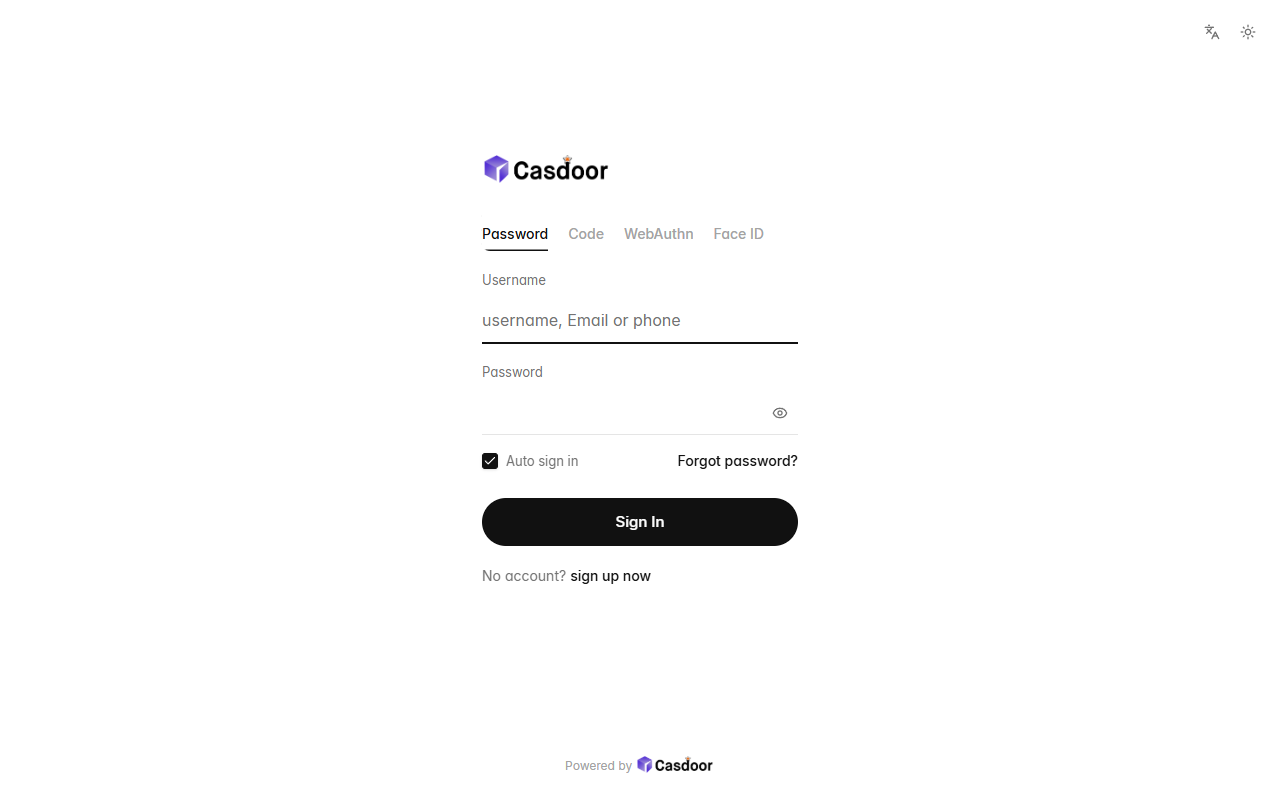
Bare
登录主题Nothing but the form: no card, no background, a small left-aligned logo, quiet text tabs, hairline fields and a round button, with plenty of white space. CSS only, so organization admins can install it.
浅色极简无卡片