
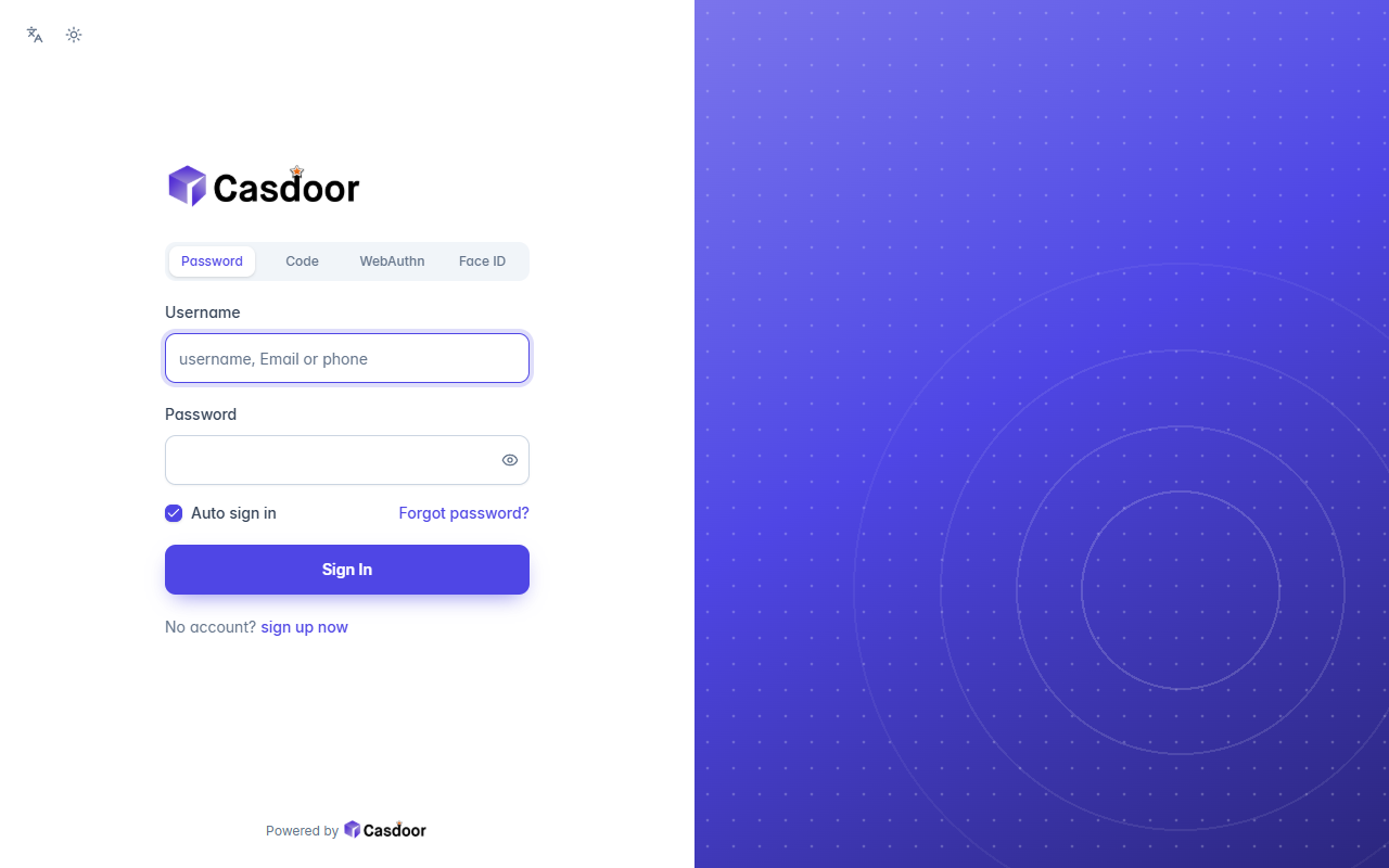
会改哪些设置
| 主题 | default |
|---|---|
| 圆角 | 10px |
| 表单位置 | 居中 |
| 表单CSS | 是 |
| 表单CSS(移动端) | 是 |
这些都在 Casdoor 应用的 界面定制 标签页里,套用主题之后还可以继续调整。
套用到应用
- 在下面填好应用,调整主题的设置,然后复制 JSON。
- 在 Casdoor 控制台打开 应用,编辑这个应用,点击顶部的 导入JSON,粘贴 JSON 后点 确定。
- 点击 保存。下次打开登录页时就会用上这个主题。
{
  "name": "<应用名称>",
  "organization": "<组织>",
  "themeData": {
    "themeType": "default",
    "colorPrimary": "#4f46e5",
    "borderRadius": 10,
    "isCompact": false,
    "isEnabled": true
  },
  "formOffset": 2,
  "formCss": "<style>\n.login-background {\n  color-scheme: light;\n  --background: 0 0% 100%;\n  --foreground: 222 47% 11%;\n  --card: 0 0% 100%;\n  --card-foreground: 222 47% 11%;\n  --popover: 0 0% 100%;\n  --popover-foreground: 222 47% 11%;\n  --muted: 210 40% 96%;\n  --muted-foreground: 215 16% 47%;\n  --accent: 210 40% 96%;\n  --accent-foreground: 222 47% 11%;\n  --border: 214 32% 91%;\n  --input: 214 32% 85%;\n  font-family: Inter, ui-sans-serif, system-ui, -apple-system, 'Segoe UI', sans-serif;\n  background: #ffffff;\n}\n.login-background > div:first-of-type,\n.login-content,\n#footer {\n  position: relative;\n  z-index: 1;\n}\n.login-background::before {\n  content: '';\n  position: fixed;\n  top: 0;\n  right: 0;\n  bottom: 0;\n  width: 50%;\n  background: radial-gradient(circle at 70% 68%, transparent 0 90px, rgba(255, 255, 255, 0.16) 90px 92px, transparent 92px 150px, rgba(255, 255, 255, 0.12) 150px 152px, transparent 152px 220px, rgba(255, 255, 255, 0.08) 220px 222px, transparent 222px 300px, rgba(255, 255, 255, 0.05) 300px 302px, transparent 302px), radial-gradient(rgba(255, 255, 255, 0.22) 1.5px, transparent 1.6px) 0 0 / 24px 24px, linear-gradient(150deg, color-mix(in srgb, #4f46e5 75%, #ffffff) 0%, #4f46e5 45%, color-mix(in srgb, #4f46e5 55%, #000000) 100%);\n}\n.login-background > div:first-of-type {\n  width: 50%;\n  justify-content: flex-start;\n}\n.login-content {\n  justify-content: flex-start !important;\n}\n.login-content > div {\n  max-width: 400px;\n  margin-left: max(0px, calc(25vw - 216px));\n}\n#footer {\n  width: 50%;\n}\n.login-panel {\n  border: none;\n  border-radius: 0;\n  background: transparent;\n  box-shadow: none;\n}\n.login-logo-box {\n  justify-content: flex-start;\n  margin-bottom: 32px;\n}\n.signin-methods > div {\n  background: #f1f5f9;\n}\n.signin-methods [role='tab'][data-state='active'] {\n  color: #4f46e5;\n}\n.login-form label {\n  color: #334155;\n  font-weight: 500;\n}\n.login-form input:not([type='checkbox']):not([type='radio']) {\n  height: 46px;\n  border: 1px solid #cbd5e1;\n  border-radius: 10px;\n  background: #ffffff;\n  box-shadow: 0 1px 2px rgba(15, 23, 42, 0.05);\n}\n.login-form input:not([type='checkbox']):not([type='radio']):focus {\n  border-color: #4f46e5;\n  box-shadow: 0 0 0 4px color-mix(in srgb, #4f46e5 18%, transparent);\n}\n.login-form [role='checkbox'][data-state='checked'] {\n  background: #4f46e5;\n  border-color: #4f46e5;\n  color: #ffffff;\n}\n.login-form a {\n  color: #4f46e5;\n  font-weight: 500;\n}\n.login-form .login-button {\n  height: 46px;\n  border-radius: 10px;\n  background: #4f46e5;\n  color: #ffffff;\n  font-weight: 600;\n  box-shadow: 0 8px 20px -8px color-mix(in srgb, #4f46e5 70%, transparent);\n}\n.login-form .login-button:hover {\n  background: color-mix(in srgb, #4f46e5 88%, #000000);\n}\n.login-form .login-signup-link {\n  justify-content: flex-start;\n}\n.login-form .login-forget-password {\n  width: 100%;\n}\n</style>",
  "formCssMobile": "<style>\n.login-background {\n  color-scheme: light;\n  --background: 0 0% 100%;\n  --foreground: 222 47% 11%;\n  --card: 0 0% 100%;\n  --card-foreground: 222 47% 11%;\n  --popover: 0 0% 100%;\n  --popover-foreground: 222 47% 11%;\n  --muted: 210 40% 96%;\n  --muted-foreground: 215 16% 47%;\n  --accent: 210 40% 96%;\n  --accent-foreground: 222 47% 11%;\n  --border: 214 32% 91%;\n  --input: 214 32% 85%;\n  font-family: Inter, ui-sans-serif, system-ui, -apple-system, 'Segoe UI', sans-serif;\n  background: #ffffff;\n}\n.login-background > div:first-of-type,\n.login-content,\n#footer {\n  position: relative;\n  z-index: 1;\n}\n.login-background::before {\n  content: '';\n  position: absolute;\n  top: 0;\n  left: 0;\n  right: 0;\n  height: 132px;\n  background: radial-gradient(circle at 70% 68%, transparent 0 90px, rgba(255, 255, 255, 0.16) 90px 92px, transparent 92px 150px, rgba(255, 255, 255, 0.12) 150px 152px, transparent 152px 220px, rgba(255, 255, 255, 0.08) 220px 222px, transparent 222px 300px, rgba(255, 255, 255, 0.05) 300px 302px, transparent 302px), radial-gradient(rgba(255, 255, 255, 0.22) 1.5px, transparent 1.6px) 0 0 / 24px 24px, linear-gradient(150deg, color-mix(in srgb, #4f46e5 75%, #ffffff) 0%, #4f46e5 45%, color-mix(in srgb, #4f46e5 55%, #000000) 100%);\n}\n.login-background > div:first-of-type button {\n  color: #ffffff;\n}\n.login-content {\n  padding-top: 40px;\n}\n.login-logo-box {\n  margin-bottom: 36px;\n}\n.login-logo-box img {\n  padding: 10px 14px;\n  border-radius: 12px;\n  background: #ffffff;\n  box-shadow: 0 8px 24px -8px rgba(15, 23, 42, 0.35);\n}\n.login-panel {\n  border: none;\n  border-radius: 0;\n  background: transparent;\n  box-shadow: none;\n}\n.login-logo-box {\n  justify-content: flex-start;\n  margin-bottom: 32px;\n}\n.signin-methods > div {\n  background: #f1f5f9;\n}\n.signin-methods [role='tab'][data-state='active'] {\n  color: #4f46e5;\n}\n.login-form label {\n  color: #334155;\n  font-weight: 500;\n}\n.login-form input:not([type='checkbox']):not([type='radio']) {\n  height: 46px;\n  border: 1px solid #cbd5e1;\n  border-radius: 10px;\n  background: #ffffff;\n  box-shadow: 0 1px 2px rgba(15, 23, 42, 0.05);\n}\n.login-form input:not([type='checkbox']):not([type='radio']):focus {\n  border-color: #4f46e5;\n  box-shadow: 0 0 0 4px color-mix(in srgb, #4f46e5 18%, transparent);\n}\n.login-form [role='checkbox'][data-state='checked'] {\n  background: #4f46e5;\n  border-color: #4f46e5;\n  color: #ffffff;\n}\n.login-form a {\n  color: #4f46e5;\n  font-weight: 500;\n}\n.login-form .login-button {\n  height: 46px;\n  border-radius: 10px;\n  background: #4f46e5;\n  color: #ffffff;\n  font-weight: 600;\n  box-shadow: 0 8px 20px -8px color-mix(in srgb, #4f46e5 70%, transparent);\n}\n.login-form .login-button:hover {\n  background: color-mix(in srgb, #4f46e5 88%, #000000);\n}\n.login-form .login-signup-link {\n  justify-content: flex-start;\n}\n.login-form .login-forget-password {\n  width: 100%;\n}\n</style>"
}更多登录主题
查看全部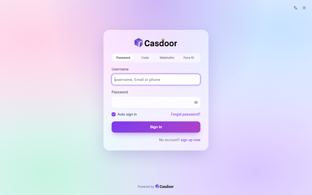
Aurora
登录主题A pastel mesh of color tinted by your accent behind a frosted glass card, with soft rounded fields and a gradient button. CSS only, so organization admins can install it.
浅色毛玻璃渐变
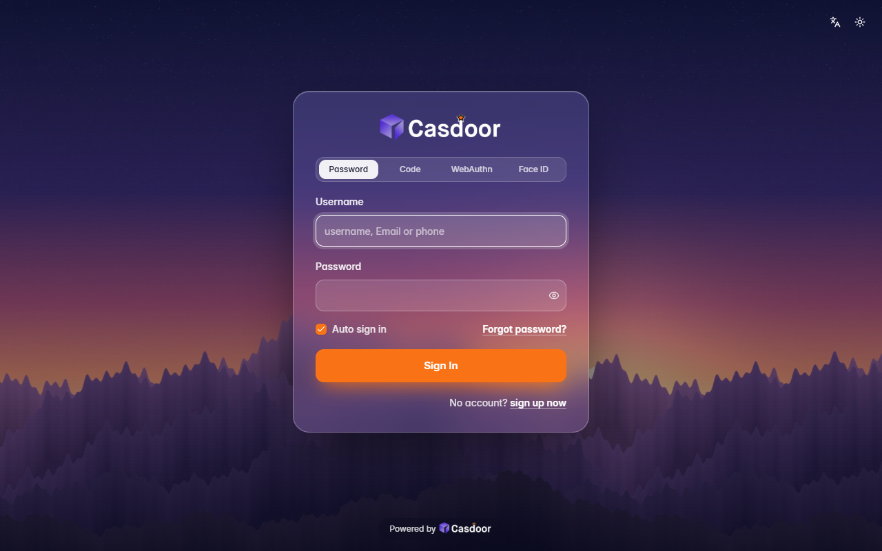
Backdrop
登录主题Your own picture behind the whole page, dimmed a little, with a frosted glass card on top. It comes with a dusk mountain scene; give it any image address to use yours. Organization admins can install it.
深色背景图毛玻璃
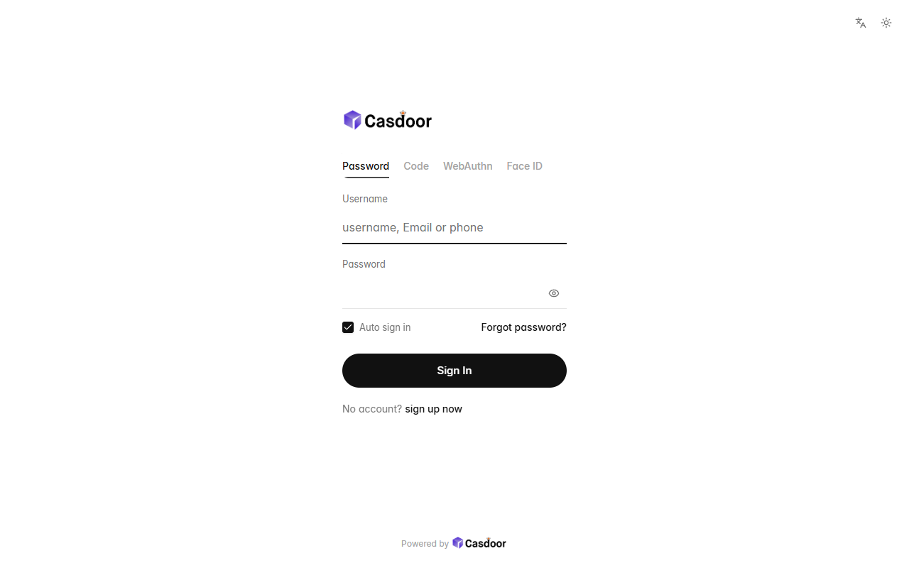
Bare
登录主题Nothing but the form: no card, no background, a small left-aligned logo, quiet text tabs, hairline fields and a round button, with plenty of white space. CSS only, so organization admins can install it.
浅色极简无卡片